
|
|
|
4 minutes
An accordion — a versatile UI pattern that could elegantly expand and collapse content with a mere click. We write this reusable component using React and styled with Tailwind CSS. Let’s dissect it step by step:
The accordion is composed of three main parts:
Accordion: The parent component that holds the accordion items.AccordionHeader: Represents the clickable header of each accordion item.AccordionPanel: Contains the content that expands or collapses when the header is clicked.import React, { useState } from "react";
export const Accordion = ({ children }) => {
const [accordionOpen, setAccordionOpen] = useState(false);
const toggleAccordion = () => {
setAccordionOpen(!accordionOpen);
};
return (
<div className="accordion py-3 border-b last:border-b-0 border-slate-300">
{children.map((child, index) => {
if (child.type.name === "AccordionHeader") {
return React.cloneElement(child, {
key: index,
accordionOpen,
toggleAccordion,
});
} else if (child.type.name === "AccordionPanel") {
return React.cloneElement(child, {
key: index,
accordionOpen,
});
} else {
return child;
}
})}
</div>
);
};Accordion component receives a children prop, which is an array of accordion items (headers and panels).accordionOpen state variable.toggleAccordion function toggles the state when an accordion header is clicked.React.cloneElement method is used to pass additional props (accordionOpen and toggleAccordion) to the child components.export const AccordionHeader = ({ children, accordionOpen, toggleAccordion, iconOpen = <IconOpen/>, iconClose = <IconClose/> }) => {
const icon = accordionOpen ? iconOpen : iconClose;
return (
<div className="accordion-header">
<button className="accordion-btn flex justify-between w-full" onClick={toggleAccordion}>
{children} <span>{icon}</span>
</button>
</div>
);
};
// Icon: Open
const IconOpen = () => (
<svg stroke="currentColor" fill="currentColor" strokeWidth="0" viewBox="0 0 1024 1024" height="1em" width="1em"
xmlns="http://www.w3.org/2000/svg">
<path d="M872 474H152c-4.4 0-8 3.6-8 8v60c0 4.4 3.6 8 8 8h720c4.4 0 8-3.6 8-8v-60c0-4.4-3.6-8-8-8z"></path>
</svg>
)
// Icon: Close
const IconClose = () => (
<svg stroke="currentColor" fill="currentColor" strokeWidth="0" viewBox="0 0 1024 1024" height="1em" width="1em"
xmlns="http://www.w3.org/2000/svg">
<path d="M482 152h60q8 0 8 8v704q0 8-8 8h-60q-8 0-8-8V160q0-8 8-8Z"></path>
<path d="M192 474h672q8 0 8 8v60q0 8-8 8H160q-8 0-8-8v-60q0-8 8-8Z"></path>
</svg>
)AccordionHeader component represents the clickable header for each accordion item.children: The content inside the header (e.g., “Accordion item 1”).accordionOpen: Indicates whether the item is open or closed.toggleAccordion: Function to toggle the accordion state.export const AccordionPanel = ({ children, accordionOpen }) => {
const className = accordionOpen ? "grid-rows-[1fr] opacity-100" : "grid-rows-[0fr] opacity-0";
return (
<div className={`grid overflow-hidden transition-all duration-300 ease-in-out text-slate-600 text-sm ${className}`}>
<div className="overflow-hidden">
<div className="accordion-panel-content pt-3 pr-3">{children}</div>
</div>
</div>
);
};AccordionPanel component contains the content that expands or collapses.accordionOpen state to determine whether to show or hide the content.className dynamically adjusts based on the accordion state (open or closed).In brief, the state and the tailwind classes manages the visibility and layout of the accordion panel content based on whether the item is open or closed. It adjusts the grid rows and opacity accordingly, while the overflow-hidden class ensures that any excess content remains hidden within the panel container. 🎨
const className = accordionOpen ? "grid-rows-[1fr] opacity-100" : "grid-rows-[0fr] opacity-0";
className based on the value of accordionOpen.accordionOpen variable represents whether the accordion item is currently open or closed.? :) is used to conditionally assign a value to className:
accordionOpen is true, the class string "grid-rows-[1fr] opacity-100" is assigned.accordionOpen is false, the class string "grid-rows-[0fr] opacity-0" is assigned."grid-rows-[1fr]": This class sets the grid rows to take up all available vertical space (1 fraction of the available space). It ensures that the panel content expands to fill the available height when the accordion item is open."opacity-100": This class sets the opacity of the element to 100%, making it fully visible."grid-rows-[0fr]": When the accordion item is closed, this class sets the grid rows to take up no vertical space (0 fractions). The panel content effectively disappears."opacity-0": When closed, this class sets the opacity to 0%, making the element completely invisible.className="overflow-hidden"
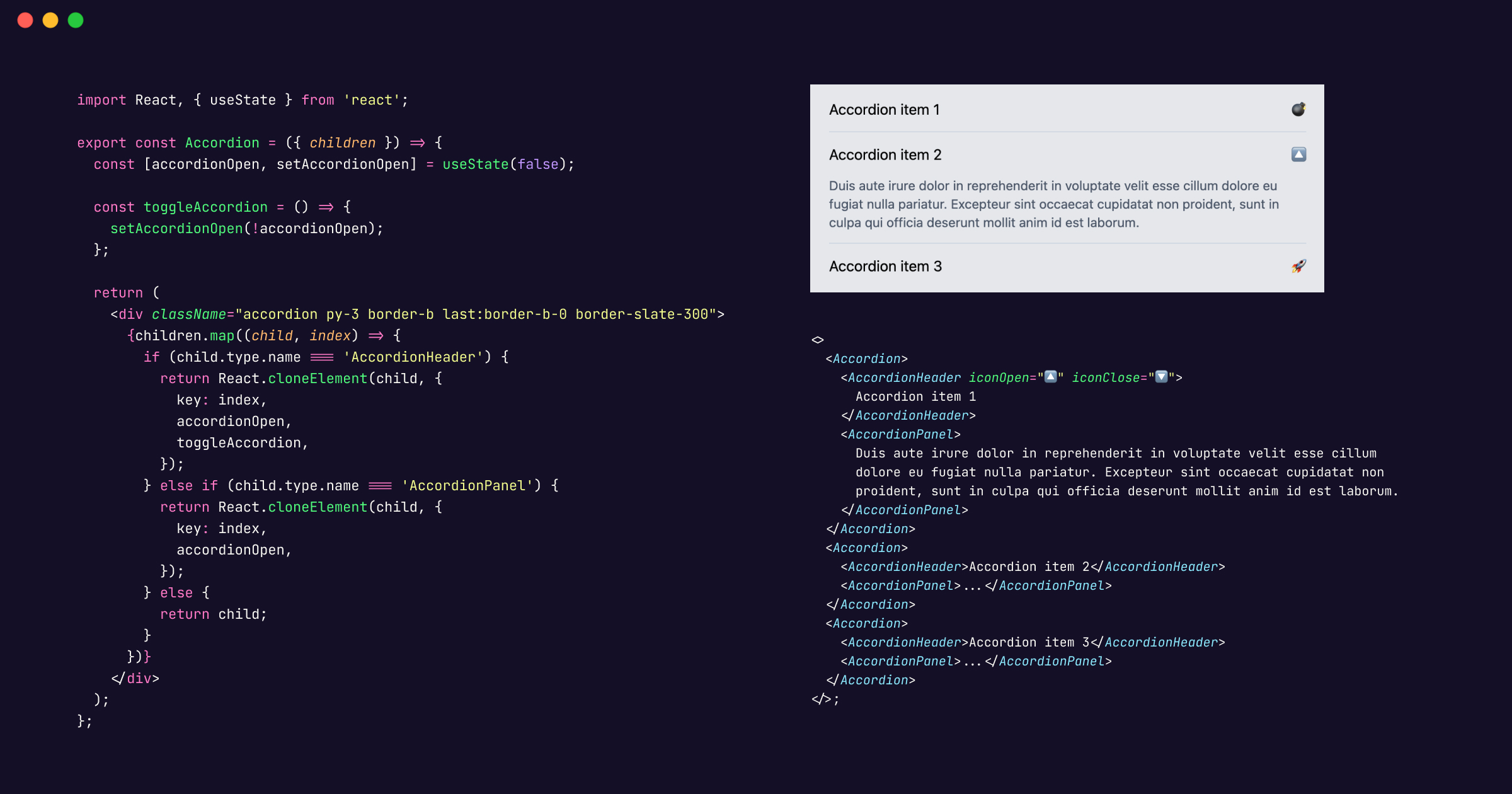
overflow-hidden class is applied directly to the container element (presumably the parent of the panel content).import { Accordion, AccordionHeader, AccordionPanel } from "./components/Accordion";
export default function App() {
return (
<div className="w-full h-screen bg-gradient-to-r from-indigo-500 to-blue-600 p-4">
<div className="py-2 px-6 bg-gray-200 rounded-lg">
<Accordion>
<AccordionHeader iconOpen="🔼" iconClose="🔽">Accordion item 1</AccordionHeader>
<AccordionPanel>
Duis aute irure dolor in reprehenderit in voluptate velit esse
cillum dolore eu fugiat nulla pariatur. Excepteur sint occaecat
cupidatat non proident, sunt in culpa qui officia deserunt mollit
anim id est laborum.
</AccordionPanel>
</Accordion>
<Accordion>
<AccordionHeader>Accordion item 2</AccordionHeader>
<AccordionPanel>
...
</AccordionPanel>
</Accordion>
<Accordion>
<AccordionHeader>Accordion item 3</AccordionHeader>
<AccordionPanel>
...
</AccordionPanel>
</Accordion>
</div>
</div>
);
}
By following these patterns, we’ve created a reusable accordion component that adapts to various use cases. Remember to customize the styling and behavior according to your project requirements. Check out the live demo on codesandbox.
Happy coding! 🚀