
|
|
|
7 minutes
Styling SVG elements can sometimes be tricky because they have their own distinct properties that may not always behave the same as regular HTML elements. Here are a few reasons why styles might not apply to SVG elements and how to address them:
SVG elements exist in a separate SVG DOM within the HTML document. This means that CSS styles defined outside the SVG DOM might not apply directly to the SVG elements. To style these elements, you can:
<style> tag within the SVG’s <defs> or directly in the SVG code.<object>, <embed>, or <iframe> tag, the external styles won’t apply due to different document scopes.SVG-Specific Properties
SVG elements use properties like fill, stroke, and stroke-width to control their appearance. These properties might not respond to regular CSS properties like color or border. For example, to change the color of an SVG path, you would use:
svg path {
  fill: red;
}
Inheritance Issues
Some styles are not inherited by SVG elements by default. You may need to explicitly set them on each element or use CSS selectors to target specific elements within the SVG.
Browser Support
Different browsers may have varying levels of support for styling SVG with CSS. Ensure that the styles you’re applying are supported across the browsers you intend to support.
Example of Styling SVG
Here’s an example of how you might include styles within your SVG:
<svg width="100" height="100" xmlns="http://www.w3.org/2000/svg">
  <style>
    .my-svg-icon { fill: blue; }
  </style>
  <circle class="my-svg-icon" cx="50" cy="50" r="40" />
</svg>
In this example, the <style> tag within the SVG allows the .my-svg-icon class to style the <circle> element with a blue fill.
Key Takeaway:
When working with SVGs, it’s crucial to understand the specific properties and styling methods unique to SVG to ensure your styles are implemented as intended.
The main purpose of the react-icons library is to provide a large collection of ready-to-use SVG icons that can be easily imported into React projects. It allows developers to include popular icons from various icon sets using ES6 imports, keeping the project size smaller and more efficient.
As for how react-icons renders SVG icons, it uses React components for each icon. When you import an icon from react-icons, you’re essentially importing a React component that renders the SVG path of the icon. This makes it straightforward to include icons in your React application as you would any other component. Here’s a simple example of how you might use an icon from react-icons:
import { FaBeer } from 'react-icons/fa';

function MyComponent() {
  return <h3>Let's go for a <FaBeer />?</h3>;
}
In this snippet, <FaBeer/> is a React component that renders the SVG for a beer icon from the Font Awesome collection. These icons can be styled and interacted with just like any other SVG or React component, using methods such as inline styles, CSS classes, or the <IconContext.Provider>.
Global Styling with <IconContext.Provider>:
import { IconContext } from 'react-icons';
import { FaBeer } from 'react-icons/fa';

function MyComponent() {
  return (
    <IconContext.Provider value={{ color: 'blue', size: '50px' }}>
      <FaBeer />
    </IconContext.Provider>
  );
}
Interacting with Icons: Event handlers like onClick, onMouseEnter, and onMouseLeave can be attached to icons for interactive functionality:
import { FaBeer } from 'react-icons/fa';

function MyComponent() {
  const handleClick = () => {
    console.log('Icon clicked!');
  };

  return <FaBeer onClick={handleClick} />;
}
Clicking the FaBeer icon triggers the handleClick function, logging a message to the console.
Styling Considerations: When styling icons, it’s important to account for SVG-specific properties such as fill, stroke, and strokeWidth, as they may not inherit styles like color directly.
Advanced Interactions: For complex interactions, consider using state management or context to manage icon appearance or behavior in response to user actions.
Performance Considerations:
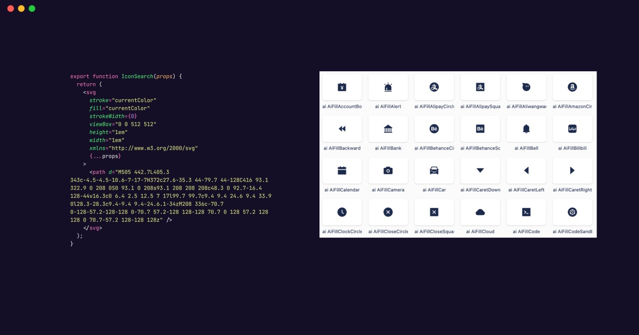
viewBox and preserveAspectRatio for proper rendering.The Rendered SVG Icon for <FaBeer />:
<svg stroke="currentColor" fill="currentColor" strokeWidth="0" viewBox="0 0 448 512" height="1em" width="1em" xmlns="http://www.w3.org/2000/svg">
  {/* SVG path */}
</svg>
The Importance of 1em and currentColor:
em unit ensures the icon’s size scales with the surrounding text, enhancing responsiveness across different screen sizes.1em maintains uniformity across the application.font-size of the icon’s container.currentColor keyword allows icons to inherit the text color of their parent element, facilitating consistent color schemes and simplifying styling.By adhering to these guidelines, you can effectively style and interact with SVG icons, enriching the user interface of your React applications. Always prioritize user experience and accessibility when integrating icons.
When you extract SVG icons from design tools like Figma, they typically come with fixed dimensions and specific colors, intended for immediate use. However, in a web application—particularly one built with React—you need icons that are more adaptable to the application’s styling and layout. This is where the react-icons library shines, with its use of relative units and color inheritance properties.
xmlns attribute defines the XML namespace necessary for correct SVG rendering in the browser. In JSX, this is usually not required unless you’re using inline SVG.fill="currentColor" and stroke="currentColor" in JSX to allow the icon to inherit colors from its parent element. Convert stroke-width to strokeWidth in camelCase for JSX compatibility.viewBox attribute is essential for maintaining the SVG’s aspect ratio and coordinate system, crucial for responsive design.1em in JSX to make the icon scale with the font size of its container.camelCase for JSX, such as changing stroke-width to strokeWidth and fill-opacity to fillOpacity.onClick and onMouseEnter to add interactivity to your SVG icons.aria-label and role to ensure your SVG icons are accessible.id, class, and data-name that are used for identification within design tools unless they serve a specific purpose in your application.const MyIconBeer = (props) => (
<svg
stroke="currentColor"
fill="currentColor"
strokeWidth={0}
viewBox="0 0 448 512"
height="1em"
width="1em"
xmlns="http://www.w3.org/2000/svg"
{...props}
>
<path d="M368 96h-48V56c0-13.255-10.745-24-24-24H24C10.745 32 0 42.745 0 56v400c0 13.255 10.745 24 24 24h272c13.255 0 24-10.745 24-24v-42.11l80.606-35.977C429.396 365.063 448 336.388 448 304.86V176c0-44.112-35.888-80-80-80zm16 208.86a16.018 16.018 0 0 1-9.479 14.611L320 343.805V160h48c8.822 0 16 7.178 16 16v128.86zM208 384c-8.836 0-16-7.164-16-16V144c0-8.836 7.164-16 16-16s16 7.164 16 16v224c0 8.836-7.164 16-16 16zm-96 0c-8.836 0-16-7.164-16-16V144c0-8.836 7.164-16 16-16s16 7.164 16 16v224c0 8.836-7.164 16-16 16z" />
</svg>
);
export { MyIconBeer }By embracing these practices, developers can create a versatile icon component library that is both performant and consistent with the user experience in React applications. The transition from static design assets to dynamic components not only enhances the visual appeal but also ensures that icons are seamlessly integrated into the interactive flow of modern web applications. This approach empowers developers to maintain a cohesive design system while also enhancing UI design with adaptable, interactive components.
Happy coding! 🚀